5-Step Checklist: Style vs Function for White vs Black Watch Dials
If you want instant readability and a sporty look, choose a matte black dial. If you want a cleaner, dressier presence for the office or formal wear, choose a white dial. Both choices are correct for different days: black tends to win for travel, low light, and casual wear, while white tends to win for polish, brightness, and a lighter visual footprint on the wrist. The sections below walk through the evidence so you can match the dial to how you actually live.
TL;DR:
- White dials tend to look larger and more open, making them ideal for formal settings and daily office wear, while black dials recede for a sportier or casual look.
- A white dial offers a speed advantage in glance-time readability due to positive polarity, but finish, contrast, and coatings often override this in real-world conditions.
- The finish and markers, such as lacquer, enamel, or sunburst, significantly influence a dial’s personality and how well it matches different wardrobe styles and occasions.
- Dial color impacts perceived size on the wrist more than actual case dimensions, with lighter tones making watches feel bigger and darker tones reducing visual bulk.
- Resale value depends more on model rarity and provenance than on dial color, as both black and white dials are consistently popular across luxury brands like Rolex.
Table of Contents
- Black vs white dial: a quick comparison by priority
- What legibility science says about black and white dials
- How finish, hands, and markers change a dial’s personality
- Why the same watch looks bigger or smaller depending on dial color
- How black and white dials age, and what that means for resale
- Wynwood Blvd’s take on matching dial color to your day
- Style versus function: what actually matters when you choose
- Where to start if you’re ready to choose
- Sources
- FAQ
Black vs white dial: a quick comparison by priority
Your priorities decide the winner here. Legibility, style, perceived size, low-light performance, upkeep, and resale each favor a different dial depending on your routine.
- Best for: black dials suit sport, travel, and everyday tool watches; white dials suit office wear, formal events, and a lighter, cleaner aesthetic.
- Legibility in daylight: high-contrast markers matter more than base color, but a matte black dial with bold white hands is a reliable quick-glance performer.
- Finish and anti-reflective coating: a strong AR coating can make a white dial just as easy to read in bright sun as a black one.
- Perceived size: light dials tend to look larger and more open on the wrist, while dark dials appear to recede and read smaller.
- Low-light and lume: contrast and lume plot design drive night readability more than dial color, though black dials often pair with heavier lume application.
- Maintenance and visible wear: white lacquer and enamel dials can show creaming or yellowing with age, while black lacquer occasionally develops a warm, brownish fade.
- Resale and collector demand: model, rarity, and provenance drive resale value far more than dial color on its own, according to Chrono24’s 2026 Rolex Report.
None of these dimensions works in isolation. A glossy black dial in direct sun can throw more glare than a matte white one, and a dressy black dial with blued hands can look just as sharp at dinner as a white one. Think about where you wear a watch most, then let the dial finish, not just the color, settle the decision.
What legibility science says about black and white dials
Readability research backs up part of the conventional wisdom, with some real caveats for watch design. A psychophysics study on positive polarity found that dark content on a light background produced substantially lower stimulus duration thresholds than the reverse in glance-like reading tasks, meaning people recognized the content faster under tested lighting conditions.
The positive polarity advantage is measurable: dark markers on a light background can be read faster in brief, glance-style viewing, according to psychophysics research.
Applied to watches, that finding suggests a white dial with dark hands and markers has a built-in speed advantage for a quick glance in good light. But watches are not lab charts. Hand thickness, marker contrast, and anti-reflective coatings change the outcome, and testing from Watch VS Guide consistently shows that finish and coatings often override whatever advantage the base color would predict on paper. A black dial with bold, outlined hands and generous lume can outperform a poorly finished white dial in the same lighting.
To judge legibility for yourself, run through this short checklist before you buy:
- Check the watch in direct sunlight and note any glare off the crystal or dial surface.
- Step into a dim room and see how long it takes your eye to find the hands.
- Look at the dial from an angle, since off-axis glare behaves differently on glossy versus matte finishes.
- Compare the hour markers against the dial background from across a room, not just up close.
- If the watch has lume, dim the lights fully and check how evenly it glows after a few minutes.
Lume and contrast usually decide night performance more than dial color. A black dial with strong lume can beat a white dial with minimal lume after dark, even though the white dial might win the daylight glance test.
How finish, hands, and markers change a dial’s personality
“White” and “black” are starting points, not finishes. A dial’s real character comes from how it is finished and how its hands and markers sit against it.
- Lacquer dials have a glassy, deep shine that reflects light sharply, which looks striking but can catch glare.
- Enamel dials, mostly seen on white dress watches, offer a smooth, almost ceramic-like finish that resists yellowing better than some lacquers over time.
- Sunburst dials radiate light from the center outward, adding depth without the flatness of a plain matte surface.
- Opaline finishes have a soft, brushed texture common on white and silver dress dials, giving a muted, refined look.
- Matte finishes on either color cut glare significantly and read as more tool-oriented or casual.
Hands and markers do as much work as the base color. Outlined hands (a dark hand with a light edge, or vice versa) hold contrast against both light and dark backgrounds. Blued hands on a white dial read as classically dressy, while bold lume plots on a black dial signal sport or field intent. Hands-on reporting on the Speedmaster’s black and white versions shows how lacquer and sunburst finishes behave very differently under the same light, changing both perceived depth and how easily you can read the time at a glance.
Matching finish to wardrobe is straightforward once you know what to look for. A glossy white enamel dial pairs naturally with a suit and dress strap, while a matte black sunburst dial fits a field jacket or weekend gear. If you want more direction on pairing dial color with wardrobe and occasion, a style guide for choosing watches and jewelry by occasion covers the basics well. For a deeper look at how color choices shape a watch’s character, see this guide to colorful dial watches.

Pro Tip: Match the finish to the use case first, then worry about color: a matte dial in either shade will serve you better for daily wear than a glossy one that shows every fingerprint.
Why the same watch looks bigger or smaller depending on dial color
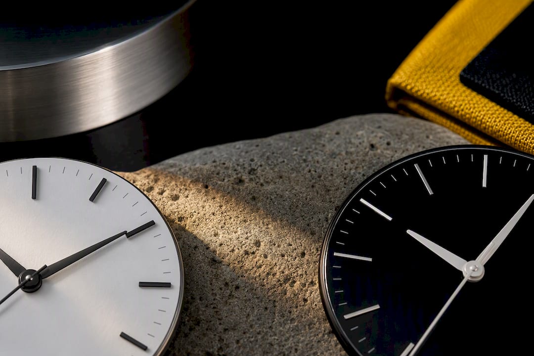
Dial color changes how large a watch appears on the wrist, independent of the actual case diameter. Light tones visually expand, making the dial feel like it fills more of the case, while dark tones recede and can make the same case look a size smaller.
- Ask to see the identical model in both white and black at the same case size, then compare them side by side under the same light.
- Watch how the bezel and lug contrast shift the eye: a dark bezel against a white dial draws attention inward, while a matching black bezel and dial can blur the line between the two.
- Note your skin tone and strap color, since a pale strap against a white dial or a black strap against a black dial creates a monochrome look that reads sleeker, while contrasting combinations draw more attention to the case edge.
If you are torn between two case sizes, a lighter dial can help a smaller case feel more substantial, while a darker dial can help an oversized case sit quieter on a narrow wrist. For readers weighing proportions on thinner dress pieces, this guide on minimalist watch style and case thinness is a useful companion when perceived size is part of the decision.
How black and white dials age, and what that means for resale
Every dial ages differently, and knowing the pattern ahead of time saves you from being surprised later. White lacquer and enamel dials can develop a light creaming or yellowing over years of UV exposure, while black lacquer occasionally shows a warm, brownish fade on older pieces. Some collectors actively seek out these aged patinas on vintage models rather than treating them as flaws.
- Wipe the dial and crystal with a soft, dry cloth after wear to prevent buildup that can dull the anti-reflective coating.
- Keep the watch out of prolonged direct sunlight when not worn, since UV exposure is the main driver of dial fading over time.
- Have the crystal’s AR coating checked periodically, since scratches or wear there affect legibility more than the dial color itself.
Resale value tracks the model far more closely than the dial color. The 2026 Chrono24 Rolex Report shows the Datejust accounting for roughly 28% of Rolex transaction value, with both white and black dials remaining staple configurations across the collection. Rarity, provenance, and demand for a specific reference matter more to what a watch fetches later than whether its dial happens to be light or dark.
Wynwood Blvd’s take on matching dial color to your day
Some watch brands build their designs around real places and routines, shaping their approach to dial color to match the life the watch is going into, not just how it looks in photos.
If your days lean toward travel, boats, or casual weekends, a bold, high-contrast dial with strong color and clear markers earns its place. If your routine calls for something you can wear from a morning meeting into dinner, a cleaner dial with a more restrained finish tends to work harder for you. Our travel-focused watch guide walks through more of this reasoning for readers building a small, versatile collection.
— Mathias
Style versus function: what actually matters when you choose
The legibility science is real, but it settles less of this decision than people assume. A positive-polarity advantage in a lab test does not mean a white dial wins every real-world scenario, and the conventional wisdom that black is automatically more “practical” overlooks how much a good AR coating and thick, high-contrast hands can close that gap.
What the evidence actually supports is this: finish and contrast decide legibility more than color does, and color decides how the watch fits your wardrobe and routine more than it decides how fast you can read the time. Readers get this backward constantly, treating dial color as a performance spec when it is closer to a styling choice with a small legibility tilt attached.

Prioritize testing the watch in your own lighting conditions first. Decide what you wear it with second. Let color be the last variable, not the first.
Where to start if you’re ready to choose
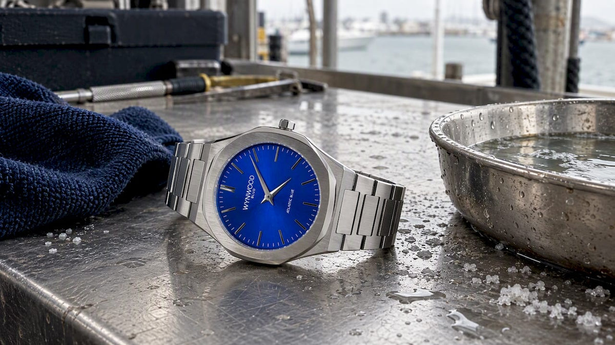
Once you know whether your routine leans casual and colorful or clean and understated, matching a dial gets easier. The Atlantic Blue Stainless Steel Automatic Watch brings a deep, high-contrast dial suited to travel and everyday wear, while the Sunset Orange Miami Inspired Watch leans into bold color for a statement piece that still reads clearly at a glance. The Keys Blue Miami Inspired Watch splits the difference with a lighter, coastal tone that pairs easily with both casual and slightly dressier outfits.

Each model is part of our full Miami Inspired Watches collection, and if you are drawn to smaller everyday pieces, our Miami Inspired Charms and Palm Tree Charms carry the same coastal design language. Businesses looking to put a dial choice to work as branded merchandise or a corporate gift can explore our Corporate Custom Watches program, with logo engraving and dial customization built around your brand. Browse the collection and find the dial that matches your own routine.
Sources
- PMC — utilising psychophysical techniques (legibility and polarity)
- Hodinkee — hands-on Speedmaster black & white
- Chrono24 — The Rolex Report 2026
- Watch VS Guide — Black dial vs white dial watches
FAQ
What does a white dial watch symbolize?
A white dial is generally read as clean, bright, and dressier, often associated with a refined or classic aesthetic rather than a sporty one. Its lighter tone also tends to make the case look slightly larger and more open on the wrist.
Which dial color is best?
Neither dial color is best on its own: the better choice depends on your routine, lighting conditions, and wardrobe. Black dials tend to suit sport, travel, and low-light use, while white dials tend to suit office and formal wear, with finish and hand contrast mattering as much as the base color, according to Watch VS Guide.
Why not wear a black dial watch?
A black dial can be a poor match if your priority is a bright, dressy look or if you want a case to read as larger on the wrist, since dark tones tend to visually recede. Glossy black finishes can also show fingerprints and dust more readily than a matte texture.
What is the most popular color of Rolex dials?
Rolex does not publish a single most-popular dial color, but the 2026 Chrono24 Rolex Report shows the Datejust, which is regularly offered in both black and white dial options, accounting for roughly 28% of total Rolex transaction value. That points to both colors remaining staple, enduring choices rather than one clearly outselling the other.