7 Copyable Watch Color Combinations for Every Wardrobe
Black, brown, steel, and navy are the most versatile watch colors, and the fastest way to multiply your options is simple: pick a watch with a neutral dial, then build a small rotation of strap colors around it. This one move lets a single watch cover casual Fridays, date nights, and client meetings. Colored straps in rubber, NATO, or canvas give you a low-cost way to test a trend without committing to a whole new watch.
TL;DR:
- Choosing neutral dial colors like black or navy and building a small strap rotation allows versatility across casual, business, and formal settings.
- Rubber, NATO, and canvas straps in bright or bold colors offer low-cost ways to test trends without committing to a full watch change.
- A strap swap can instantly alter a watch’s mood and personality, with material choices affecting both appearance and maintenance needs.
- Blue has become the most popular dial color in 2026, appearing on about a quarter of new watches, with orange and green straps gaining popularity as trend accents.
- Investing in a neutral dial first and experimenting with strap colors minimizes risk and maximizes versatility in personal wardrobe integration.
Table of Contents
- How dial color, case finish, and strap material change perceived color
- Which colors to own and when to wear them
- Choose strap colors and materials to transform a watch’s mood
- Copyable pairings for casual, business-casual, and formal situations
- Ready-to-use color-and-strap recipes grouped by mood
- 2026 color trends and safe ways to adopt them
- How we think about color at WYNWOOD BLVD
- Understanding color theory basics for your watch
- What your watch color says about your style
- Choosing watch colors for your skin tone and wrist size
- Why most watch color advice misses the point
- Start building your color rotation with WYNWOOD BLVD
- FAQ
- Sources
How dial color, case finish, and strap material change perceived color
A watch reads as one of two things: harmonious or jarring. Harmony comes from tonal families, colors that sit close together on the color wheel or share warmth. Contrast comes from pairing opposites, like a navy dial against a tan strap, and it works when one element stays muted while the other carries the color.
Metal matching matters more than most people think. Gold, rose gold, and brass are warm metals that pair naturally with brown leather, olive, and burgundy. Steel, white gold, and platinum are cool metals that sit better with black, gray, and navy. Mixing warm and cool metals on the same wrist, say a steel case with a gold buckle, usually looks like an accident rather than a choice.
Strap material changes how a color reads, too. The same blue looks relaxed in rubber, sporty in nylon, and dressy in leather.
- Leather softens color and reads formal, especially in black or deep brown.
- Rubber and silicone make bright colors feel durable and casual, ideal for orange, yellow, or green.
- Nylon and canvas mute color slightly and feel rugged, suited to khaki, navy, or olive.
- Metal bracelets neutralize color entirely and let the dial do the talking.
Pro Tip: If you only buy one extra strap, make it a brown leather one. It bridges casual and business looks better than almost any other single swap.
Which colors to own and when to wear them
Not every color pulls equal weight in a rotation. Some work with nearly everything you own, others ask you to build an outfit around them.
- Black works day or night, with a suit or jeans, and remains the safest choice for formal events.
- Brown or tan pairs with leather belts and shoes, making it the natural choice for business-casual and weekend wear.
- Steel, silver, and white or cream dials read as neutrals, which is why watch strap guides and retailer blogs consistently name black, brown, and silver as the most wearable watch colors for daily rotation.
- Navy or blue splits the difference between casual and dressy, and it has become the default modern choice. Blue was the single most common dial color among new releases tracked at Watches & Wonders 2026, appearing on roughly a quarter of the pieces in that dataset.
- Green and salmon are commitment colors. They look sharp as a statement piece but demand a wardrobe with muted neutrals around them.
If you’re building a two-watch collection, lead with black or navy, then add a brown leather option. That combination covers almost every occasion without duplicating effort.
Choose strap colors and materials to transform a watch’s mood
A strap swap changes a watch’s personality faster than anything else you can do to it, and it costs far less than buying a second watch.
- Match strap warmth to your leather accessories: a cognac strap echoes brown shoes and belts, while a black strap echoes black ones.
- Reach for rubber or silicone when you want vibrant color that survives sweat, water, or daily knocks.
- Choose NATO, canvas, or velcro straps for inexpensive personality changes. NATO straps carry military roots and can make a small vintage watch feel larger on the wrist, while velcro styles suit dive and beater use and come in a wide range of colorways.
- Build a rotation of three or four straps, one black leather, one brown leather, one rubber in a bright color, and one NATO in a neutral tone, to cover nearly every outfit without new hardware.
Strap material also dictates upkeep. A detailed comparison of strap materials lays out how rubber cleans easily and resists moisture, leather needs occasional conditioning, and canvas or nylon stays low-maintenance but can hold onto sweat after long wear. Knowing this before you buy a strap saves you from replacing a favorite color after one humid summer.
Copyable pairings for casual, business-casual, and formal situations
The fastest way to dress a watch correctly is to treat it like any other accessory: match its formality to the room you’re walking into.
Casual:
- A dive watch on a NATO strap pairs naturally with jeans and a t-shirt.
- A steel-cased watch on tan leather works with chinos and a button-down.
- Bright rubber straps in orange or yellow suit gym bags, beach days, and anything active.
Business-casual:
- A navy dial on brown leather splits formal and relaxed cleanly, good for an office without a strict dress code.
- A steel bracelet under a sport coat reads polished without tipping into black-tie territory.
Formal:
- A slim dress watch on black leather is the standard choice for suits and evening events.
- Polished steel or gold-toned metal on a simple dial keeps the focus on tailoring, not the wrist.
Pro Tip: If you’re wearing a colored strap to a dressier event, echo that color in a small accessory, like a pocket square or sock, so it reads intentional instead of accidental.
Ready-to-use color-and-strap recipes grouped by mood
A good recipe gives you a starting point you can adjust without overthinking it.
- Classic: black dial, black leather strap, polished steel case. Works for nearly any dress code and ages well.
- Nautical: navy dial, white stitching, steel bracelet. The contrast between navy and steel reads crisp without trying hard.
- Bold statement: orange dial or strap against a black case. The high contrast makes a small watch feel bigger on the wrist.
- Minimalist: white or cream dial, tan leather, thin steel case. Clean lines keep the focus on proportion rather than color.
- Vintage-inspired: brown dial, distressed leather strap, brass-toned case. The warm palette mimics the look of an heirloom piece.
- Everyday blue: steel-blue dial, rubber strap in matching tone. Blue’s growing popularity makes this an easy daily choice that still feels current.
- Tonal green: olive dial, canvas strap, muted metal accents. Works well with earth-toned fall wardrobes.
Small tweaks personalize any of these without changing the core formula: swap a stitch color, choose a brushed instead of polished case edge, or pick a buckle tone that matches your other metal accessories like a belt buckle or ring.
2026 color trends and safe ways to adopt them
Blue dials dominate new releases this year, and colored straps continue gaining ground as an easy personalization tool. Blue appeared on roughly a quarter of tracked pieces at Watches & Wonders 2026, making it the safest trend to adopt because it’s so widely produced and easy to pair. Orange and green accents are showing up more often too, particularly on straps rather than full dials.
- Try a trend through a strap swap before buying a new watch in that color.
- Keep one neutral daily watch and let a second, bolder piece absorb the trend risk.
- Ask whether the color pairs with at least three items already in your closet before committing.
- Favor rubber or NATO straps for trend colors since they cost less than leather and wear well.
If a color still looks appealing after you’ve tried it on a strap for a few weeks, it’s probably safe to invest in a full watch in that shade.
How we think about color at WYNWOOD BLVD
Our collections draw color from natural and coastal inspirations, with each piece designed to carry a story while staying wearable day to day.
- The Sunset Orange watch uses a warm, saturated dial that works as a statement piece without losing legibility or restraint.
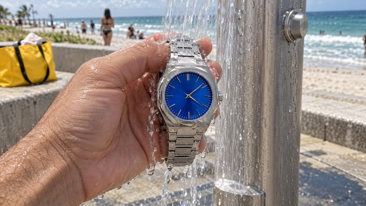
- The Keys Blue watch shows how a blue dial can sit comfortably between a daily piece and a conversation starter.
If you’re picking a signature color, choose one tied to something you actually wear often, then let strap swaps handle the rest of your variety.
Understanding color theory basics for your watch
Two simple color-wheel concepts cover almost every watch pairing decision you’ll make. Complementary colors sit opposite each other on the wheel, like blue and orange or green and red. A navy dial with an orange accent on the second hand or bezel uses this contrast to make small details pop without overwhelming the piece.
Analogous colors sit next to each other on the wheel, like blue and green or orange and yellow. These pairings feel calmer because the eye doesn’t have to resolve strong contrast. A teal dial with a navy strap is an analogous pairing, and it reads cohesive rather than jarring.
Collector discussions commonly suggest pairing contrasting accents, like green or orange against a black bezel or white indices, to lift an otherwise plain dial. This is the complementary principle at work in practice. You don’t need formal training to use these ideas. Look at your dial’s dominant color, decide whether you want a calm or energetic pairing, and choose your strap or accent accordingly. A calm look pulls from colors next to the dial color on the wheel. An energetic look pulls from the opposite side.

What your watch color says about your style
A watch sits closer to your hands than almost any other accessory, which means people notice it during handshakes, meetings, and casual conversation. The color you choose sends a quiet signal before you say a word.
Black and steel read as controlled and professional. Brown leather reads as relaxed and classic, often associated with someone who values quality over flash. Bright colors like orange or green read as confident and a little playful, suggesting someone comfortable standing out.

None of these signals are fixed rules, but they shape first impressions the same way a tie color or shoe choice does. If you want to appear dependable in a work setting, a neutral dial does that work for you automatically. If you want to signal personality or creativity, a colored dial or strap gives you that latitude without saying a word. The key is matching the signal to the setting: a bold orange dial that reads as confident at a weekend event might read as mismatched in a conservative boardroom.
Choosing watch colors for your skin tone and wrist size
Skin tone affects how warm or cool a metal and strap color appear against your wrist. Warmer skin tones tend to pair well with gold, rose gold, and brown leather, since these colors echo undertones already present in the skin. Cooler skin tones often look sharper with steel, white gold, and black or navy straps, which create a crisper contrast.
Wrist size plays a role too, though it affects proportion more than color. A smaller wrist can be overwhelmed by a large, high-contrast dial, so a tonal or analogous pairing often looks more balanced than a bold complementary one. A larger wrist has more room to carry high-contrast combinations, like a black dial with a bright orange strap, without the color feeling like it’s competing with the watch’s size.
Neither factor is a strict rule. The simplest approach is to try a strap color against your wrist in daylight before buying, since lighting changes how warm or cool a color appears more than most people expect. If a color looks muddy or washed out against your skin in natural light, it will likely read the same way in photos and in person.
Why most watch color advice misses the point
Most watch-color guides treat color as a static choice: pick one dial, match it forever. That advice undersells how cheap and easy it has become to change a watch’s entire mood with a strap swap. The real skill isn’t picking the “right” color once, it’s building a small rotation that lets one or two watches cover your whole wardrobe.
The conventional wisdom also overweights trend colors. Chasing a hot shade on your main watch is a bigger commitment than most people realize, since a dial can’t be swapped the way a strap can. Testing a trend on a $20 rubber or NATO strap tells you more about whether you’ll actually wear that color in six months than any amount of browsing.
If you take one thing from this guide, let it be this: invest in a neutral dial first, then spend your experimentation budget on straps. That order protects your money and still lets you try every color on this list.
— Mathias
Start building your color rotation with WYNWOOD BLVD
We design our watches around real Miami color stories, so you get a dial with personality rather than another plain steel face. If you want a statement piece that still works across a real wardrobe, our Sunset Orange watch and Keys Blue watch give you two very different moods built on the same minimalist foundation.

- Browse the full Miami Inspired Watches collection to compare dial colors side by side.
- Pair a watch with a Palm Tree Charm or pendant from our charms collection for a matched set.
- Outfitting a team or storefront? Our Corporate Custom Watches program lets businesses order branded pieces with custom dials and packaging.
Explore the watches collection and find the color that fits your rotation.
FAQ
What is the 3 watch rule?
The 3 watch rule suggests building a small collection of three watches, typically one dress watch, one everyday or sport watch, and one casual or rugged option, so you’re covered for any occasion. It’s a loose guideline rather than a fixed standard, and many collectors adapt it based on their own wardrobe and lifestyle needs.
What are the rules for coordinating watch strap colors?
Match strap warmth to your other leather accessories, like a brown strap with brown shoes and a black strap with black ones, and keep metal tones consistent between the case and buckle. Beyond that, colored straps in rubber, NATO, or canvas offer an inexpensive way to experiment with bolder colors without the same formality constraints as leather.
What is the most versatile color for a watch?
Black, brown, and steel or silver are widely considered the most versatile watch colors because they pair with nearly any outfit and occasion. Navy has also become a strong contender, since it balances casual and dressy looks better than most other colors.
Which color watch is trending now?
Blue dials are currently the most common choice among new watch releases, appearing on roughly a quarter of the pieces tracked at Watches & Wonders 2026. Colored straps in orange and green are also gaining traction as low-cost ways to try a bolder look.
Sources
- The biggest watch trends of 2026, according to the numbers | British GQ
- Why coloured strap watches are hitting the right tone in 2025 | British GQ