Designers: 4 Miami Color Palettes, Importable Swatches & WCAG Tips
We put together four ready-to-use Miami palettes: Art Deco pastel, Miami Vice, Tropical vivid, and Wynwood neon, each with hex codes you can copy right now. Download files cover ASE, ACO, Procreate swatches, and PNG strips. Before you drop any of these into body text, check contrast against WCAG 2.2 Level AA standards.
TL;DR:
- Pastel hues like mint and coral from the Art Deco palette require careful contrast checking, especially for body text, with a minimum ratio of 4.5:1 for accessibility.
- Miami Vice colors are designed for dark backgrounds, with pastel accents placed against near-black rather than white, to preserve their glow effect.
- Tropical vivid colors can be used for loud, maximalist designs but should be contrasted appropriately for readability and visual impact.
- Wynwood neon accents should be sparingly used as highlights or UI elements against charcoal or white, not as full backgrounds.
- Combining multiple Miami-inspired palettes without a clear plan can lead to noise; select one mood and build your color system around it.
Table of Contents
- Curated Miami palettes and when to use them
- Downloadable swatches and how to import them
- Keeping pastel and neon palettes accessible
- Building a custom Miami-inspired palette
- Where these colors actually come from
- Designer perspective: avoiding Miami clichés
- Turning a palette into real merchandise
- FAQ
- Sources
Curated Miami palettes and when to use them
Each palette carries its own mood, so pick based on the feeling you want, not just the colors you like.
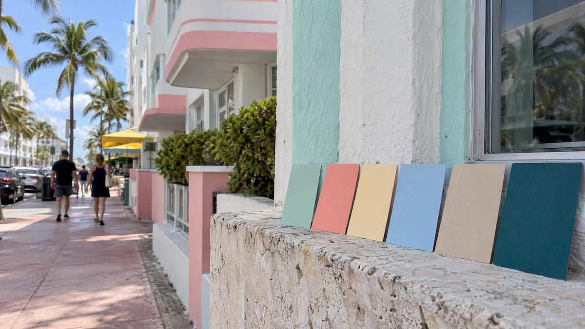
Art Deco pastel pulls from the historic Ocean Drive buildings: soft mint (#A8DAD5), coral pink (#F4A9A8), buttercream (#F6E9D7), powder blue (#A7C7E7), sand (#E8D5B7), and deep teal trim (#2A6F6F). Use the saturated tones as trim or ornament against pale bodies, following the original Horowitz approach of pale walls with saturated accents. This works for hospitality branding, wedding invitations, or any identity that needs warmth without noise.
Miami Vice runs on four colors: luminous teal (#0BD2D3), flamingo pink (#F990E8), white (#FFFFFF), and near-black (#000000), a palette built around a production decision to avoid earth tones entirely. Place the pastels against the black field rather than white. The glow effect only shows up on a dark ground.
Tropical vivid leans into maximalism with fuchsia (#EF95EF), lime (#C2E3A1), teal (#4EE4B2), ember (#D55C20), emerald (#31A531), and cerulean (#95E0EF), a set drawn from tropical garden color collections. This fits editorial layouts, social posts, and packaging that wants to feel loud on purpose.
Wynwood neon uses electric magenta, acid green, and safety orange as accents against charcoal or white, echoing the mural district’s street-art energy. Apply these sparingly, as highlights or call-to-action elements, never as a full background.
- Art Deco pastel: hospitality branding, print invitations, packaging trim.
- Miami Vice: nightlife branding, dark-mode UI accents, album art.
- Tropical vivid: editorial spreads, social graphics, maximalist packaging.
- Wynwood neon: street-art inspired logos, buttons, small UI highlights.
Downloadable swatches and how to import them
We offer the hex list, ASE, ACO, Procreate swatch files, a GIMP-compatible GPL file, and PNG/SVG strips for quick reference.
- Illustrator or Photoshop: open the Swatches panel, choose “Open Swatch Library,” then load the ASE or ACO file.
- Procreate: import the swatch file directly into your Procreate swatches library from the Files app.
- Figma: paste hex values into a local styles panel, or import a plugin that reads ASE files.
- GIMP: drop the GPL file into your palettes folder and restart the application.
For web work, stick to sRGB values. For print, convert to CMYK or match against Pantone references before sending files to a printer, since screen hex rarely translates one to one on paper.
Pro Tip: Keep one master swatch file per project and update it in a single place so every exported asset stays consistent.
These palettes are free to use in personal and commercial design projects.
Keeping pastel and neon palettes accessible
Pastel-heavy palettes look soft and inviting, but softness often means low contrast, which creates real problems for body text and small UI elements.
The standard to hit is a contrast ratio of 4.5:1 for normal text under WCAG 2.2 Level AA. That single number decides whether your pastel palette reads as elegant or illegible.
Powder blue (#A7C7E7) on white fails badly for body copy. Deep teal (#2A6F6F) on buttercream (#F6E9D7) passes comfortably. Flamingo pink (#F990E8) on pure black clears the bar for large headline text but can struggle at smaller sizes, so test before you commit.
- Reserve saturated hues for headlines, icons, and short labels, not paragraphs.
- Pair Miami Vice pastels with near-black grounds, not white, to preserve the glow effect described in analysis of the dark-ground technique.
- Keep Art Deco pastels as trim on pale bodies rather than as text color.
- Never rely on color alone for button states or status indicators; add an icon or label too.
Building a custom Miami-inspired palette
Start by picking one mood: Art Deco, Miami Vice, Tropical, or Wynwood neon. Mixing all four without a plan is how palettes turn into noise.
- Choose one or two dominant accent colors from your chosen mood.
- Add structural neutrals: white, near-black, sand, or charcoal, to carry most of the layout.
- Pick text colors and run contrast checks against every background you plan to use.
- Generate a light and dark variant so the system works across contexts.
- Export as design tokens with clear names:
color-accent-primary,color-neutral-bg,color-text-body.
A sample token set for a coastal lifestyle brand: accent-primary: #4EE4B2, neutral-bg: #F6E9D7, text-body: #2A2A2A.
Pro Tip: Name tokens by function, not by hue, so a future color swap never breaks your naming system.
Where these colors actually come from

Miami’s pastel tradition traces back to the Art Deco Painting Incentive Program, which offers matching grants covering up to 50% of eligible painting costs, capped at $20,000 per property, a heritage well explained in Miami’s Art Deco District. That program helped preserve the Horowitz pastel scheme across Ocean Drive’s historic buildings.
Miami Vice took a different route: producers banned earth tones outright, building the show’s look around teal, pink, white, and black to feel aspirational rather than realistic.
Pastel trim on pale walls, or neon pastel against black. Two eras, two rules, and neither one tolerates sloppy mixing.
Knowing where a palette comes from helps you apply it with intention instead of guessing at what “feels Miami.”
Designer perspective: avoiding Miami clichés
Miami palettes turn cliché the moment every color fights for attention at full saturation. The fix is restraint: let one or two accents carry the energy and let neutrals do the heavy lifting.
Mixing eras without a plan, Art Deco pastel bleeding into Wynwood neon, is a common misstep. Choose a dominant mood and use a neutral as the bridge between them, a strategy echoed in guidance on combining tropical and neon palettes.
A coastal lifestyle brand reads better in Art Deco pastel. A nightlife brand reads better in Miami Vice teal and pink against black.
— Mathias
Turning a palette into real merchandise
Once you’ve locked a palette, we can help you carry it into physical product. Our Palm Tree Charm in Silver Signature Painted suits cooler palettes like Art Deco pastel or Tropical cerulean tones. The Gold Classic Palm Tree Charm pairs naturally with warm Tropical or Wynwood accents, while the Gold Signature Painted version works well against bold Miami Vice color stories.

- Shop the full Palm Tree Charms collection for pieces that already echo these palettes.
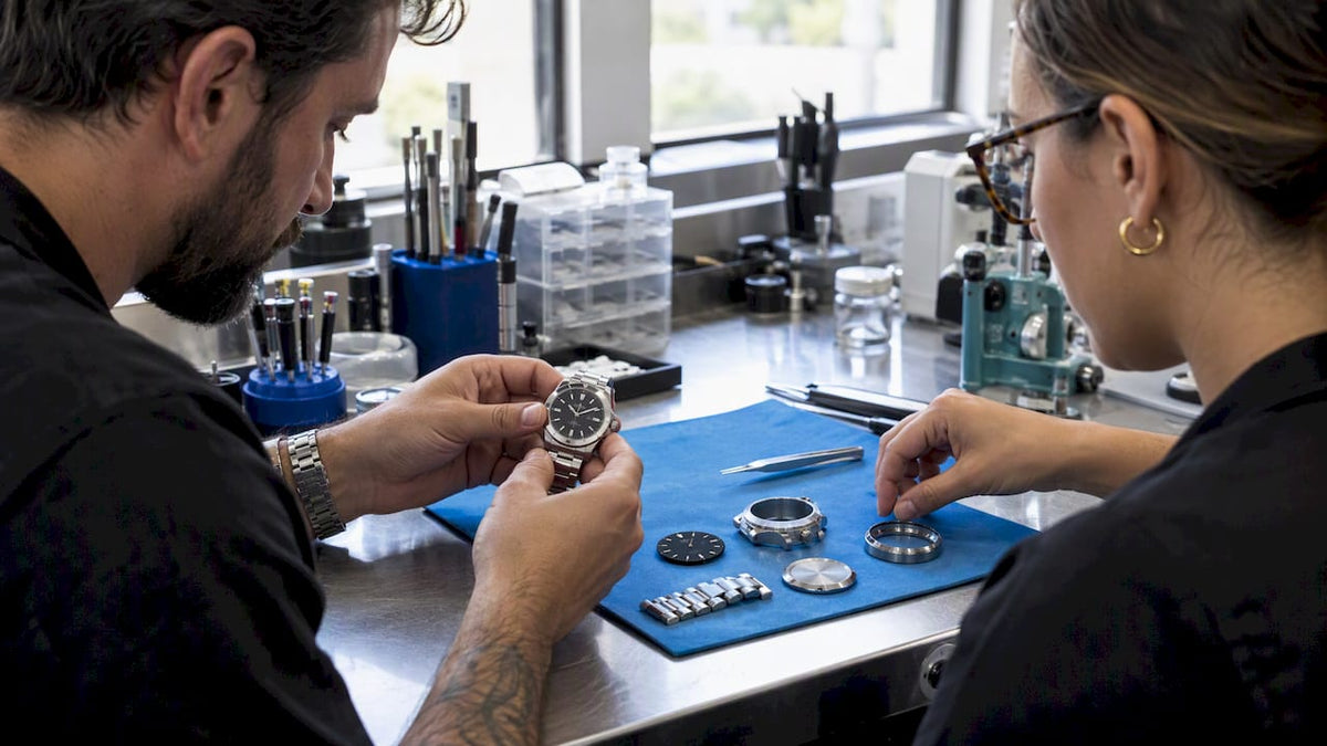
- Browse Miami Inspired Watches if you want a dial that matches your project’s accent color.
- Request a Corporate Custom Watch order and ask us to color-match your brand’s exact palette during production.
If you manage a hotel, agency, or real estate brand and want merchandise inspired by your chosen Miami palette, we offer options for bulk orders with logo engraving and dial customization.
FAQ
What are some Miami colors?
Common Miami colors include pastel mint, coral pink, and powder blue from the Art Deco tradition, plus teal, flamingo pink, white, and black from the Miami Vice palette. Tropical and Wynwood neon palettes add saturated fuchsia, lime, and electric accents for bolder projects.
What is Miami style called?
The historic pastel building tradition on Ocean Drive is generally referred to as Miami Art Deco, tied to the Art Deco Painting Incentive Program. A separate, more contemporary aesthetic draws from the Miami Vice era and the Wynwood arts district’s mural culture.
What are Miami Vice colors?
The core Miami Vice palette uses teal (#0BD2D3), flamingo pink (#F990E8), white (#FFFFFF), and black (#000000). Producers chose this set deliberately, avoiding earth tones to give the show a modern, aspirational look.
What are Miami heat colors?
Miami’s sports and heat-inspired color schemes typically lean on vivid reds, oranges, and black, distinct from the pastel Art Deco or teal-and-pink Miami Vice palettes covered here. For design projects referencing Miami’s broader visual identity, the Tropical vivid palette offers a closer match with its warm ember and coral tones.
Sources
- Miami Vice color palette — SchemeColor
- Contrast requirements for WCAG 2.2 Level AA — Make Things Accessible
- What is Miami Vice Pastel Teal (1984)? — DesignByCurio