6 Signs a Minimal Watch Is Lazy and 3 Watches That Get It Right
Minimal watch design is purposeful reduction: every remaining element on the dial, case, and strap has to earn its place. Good minimalism is a design discipline, not an absence of decisions. What separates a thoughtfully minimal watch from a lazy one comes down to execution: how depth, finishing, and proportion get handled once the clutter is gone. The rest of this guide walks through the elements, style families, and buying criteria that reveal the difference.
TL;DR:
- Minimalist watches require deliberate design choices, such as domed dials and applied indices, to create depth and visual richness beyond flat surfaces.
- Proper case finishing, like subtle curvature and consistent treatment from bezel to lugs, enhances perceived quality and prevents a rushed appearance.
- Selection of markers and proportions, including hand length and case size, are critical in ensuring the watch looks intentional rather than underdeveloped.
- High-quality examples often feature automatic movements, sapphire crystals, and colored dials inspired by real places, reinforcing both aesthetic and mechanical value.
- Informed buying focuses on fit, finishing, and movement type first, with red flags including flat crystals, inconsistent finishes, and vague specifications.
Table of Contents
- What Does Minimal Watch Design Actually Mean?
- The Core Elements That Separate Good Minimalism From Lazy Minimalism
- Which Design Traditions Shape Minimalist Watches?
- How Do You Evaluate a Minimalist Watch Before Buying?
- How Should You Style and Care for a Minimalist Watch?
- How Wynwood Blvd Applies These Design Principles
- Why Intentional Restraint Beats Empty Simplicity
- Wear the Difference: Wynwood Blvd’s Approach to Minimalist Design
- Sources
- FAQ
What Does Minimal Watch Design Actually Mean?
Minimalist watches are defined by a philosophy of reduction: designers strip away everything that doesn’t serve the core job of telling time, then refine what’s left until it works harder. That’s the definition aBlogtoWatch uses to separate genuine minimalism from watches that are just plain sparse, and it’s the right one. A dial with two hands and no markers isn’t automatically minimalist. It might just be underdesigned.
The distinction matters because “simple” and “minimal” get treated as synonyms, and they aren’t. Simple can mean nothing was decided. Minimal means everything was decided, and then most of it got removed. A Bauhaus-trained designer spends weeks on hand length and marker spacing before settling on “just a line and a dot.” That decision process is invisible in the final product, which is exactly the point, and exactly why lazy minimalism is so easy to mistake for the real thing at first glance.
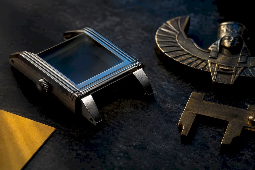
Design commentary on this topic consistently returns to one failure mode: treating the case like a flat pie dish, where a designer assumes fewer dial elements means less work everywhere else too. It doesn’t. A minimalist case still needs curvature, facets, and lug integration that respects how the watch actually sits on a wrist. Skip that step and you get a watch that looks unfinished rather than restrained.
Because the dial can’t hide behind busy printing or a crowded date window, designers who take minimalism seriously lean on techniques that don’t show up in a spec sheet:
- Domed dials that catch light differently across their surface instead of sitting flat and dead
- Applied indices with their own shadow and dimension, rather than printed markers that read as flat ink
- Subtle sunray or vertical brushing on the dial surface that shifts tone as the wrist moves
- Stepped sectors where the chapter ring sits at a different depth than the dial face
- Consistent case finishing that reinforces restraint instead of looking like a cost-cutting shortcut
None of these show up in a photo taken from six feet away. That’s exactly why they matter. Anyone can point a camera at a bare dial and call it minimalist. Getting a bare dial to look intentional under raking light is the actual craft, and it’s the difference this whole article is built around.
The Core Elements That Separate Good Minimalism From Lazy Minimalism
Six components decide whether a minimalist watch feels designed or just undercooked. Judge each one on its own before judging the watch as a whole.
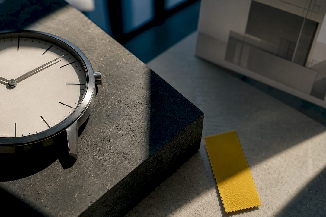
- The dial. Look for a domed or gently stepped surface rather than a flat plane. Applied indices catch and lose light as you tilt your wrist. Printed markers don’t. That single difference is often the fastest way to spot a watch that invested in dial-making versus one that outsourced it to a stamping press.
- The hands. In a two-hand or three-hand layout, hand proportion carries almost the entire visual weight of the watch. Hands that taper correctly and sit at the right length relative to the dial’s radius read as deliberate. Hands that are slightly too short, too thick, or mismatched in finish read as an afterthought, and on a minimal dial there’s nowhere for that mistake to hide.
- Markers. Whether it’s a full set of applied batons, a handful of dots, or nothing but a printed minute track, marker choice sets the whole personality of the piece. Sparse markers demand more precision in placement, since a marker that’s a fraction off center is far more noticeable with fewer neighbors around it.
- Case and lugs. This is where flat, uncurved case walls give away a rushed design. A well-executed case uses subtle curvature and facet lines so light breaks across the metal instead of sitting inert. Lug integration, how smoothly the lugs flow from the case rather than looking bolted on, is one of the clearest tells of design intent.
- Crystal and depth. A domed sapphire crystal does more than protect the dial. It magnifies the center slightly, adds a rim of distortion at the edges, and gives the whole face a sense of three-dimensionality that a flat mineral crystal can’t match. Coordinating dial design, crystal profile, and case geometry together is what makes a stripped-down face still feel rich instead of hollow.
- Strap or bracelet. A minimalist watch on the wrong strap looks unfinished no matter how good the dial is. A tapered leather strap in a neutral tone reinforces restraint; a bulky sport strap on a dressy dial fights the design instead of supporting it.
Pro Tip: Hold the watch under a single overhead light and rotate your wrist slowly. A well-finished minimalist piece will show at least two or three distinct light reflections across the dial and case. If the whole surface reflects as one flat plane, the finishing didn’t get the attention the design deserved.
Finishing consistency ties all six elements together. A case that mixes brushed lugs with a polished bezel and a matte dial needs those transitions to feel deliberate, not random. Consistent finishing choices reinforce the sense of restraint that minimal watch design is supposed to deliver. Inconsistent finishing does the opposite: it makes a $200 watch look like it’s trying to be a $2,000 watch and falling short at every seam.
Which Design Traditions Shape Minimalist Watches?
Minimalism isn’t one look. It’s a handful of design traditions that arrived at reduction from different starting points, and knowing them helps you name what you actually respond to when you’re shopping.
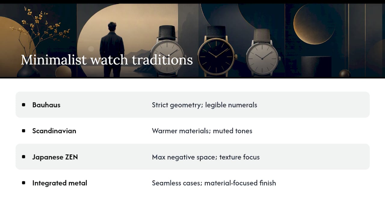
Bauhaus is the tradition most people picture first: strict geometry, even spacing, and a legibility-first approach to hands and numerals that traces back to early-20th-century German design education. Bauhaus watches tend to use a simple sans-serif numeral set, a clean circular dial, and hands with almost no ornamentation. The goal is a face you can read in under a second from across a room.
Scandinavian minimalism softens Bauhaus rigidity with warmer materials and a slightly more tactile approach. Restrained color palettes, muted dial tones, and a preference for leather over metal show up often here. It’s minimalism that wants to feel lived-in rather than clinical.
Japanese ZEN design philosophy leans hardest into negative space. Where Bauhaus uses geometry to organize information, ZEN-influenced design often removes information entirely and lets silence on the dial do the work. Texture becomes more important than markers, and a single small detail, a subtly textured dial surface, a hairline second hand, carries the entire visual interest.
Seamless metal or integrated design takes a different route altogether: material does the talking instead of dial composition. Titanium cases built with a unified, seamless surface treatment prioritize thinness and a continuous feel between case and bracelet, letting the metal’s own finish carry the minimalist statement rather than the dial layout. A related approach shows up in watches that pair a quiet automatic movement with deliberately neutral branding and materials chosen to keep the dial calm, a strategy Mudita’s Moment uses to similar effect.
Small details move a watch between these families more than people expect. Swap a printed baton for an applied one, and a Bauhaus-leaning dial suddenly reads more Scandinavian. Add one textured sector to an otherwise flat ZEN-style dial, and the whole mood shifts from silent to quietly complex.
How Do You Evaluate a Minimalist Watch Before Buying?
Buying well means checking fit, finishing, and movement origin before price, and treating price as a signal rather than a guarantee. Guides that survey dozens of minimalist watches consistently point buyers toward the same practical criteria: fit first, finishing second, movement third.
Fit comes first because a minimalist dial has nowhere to hide a bad proportion. Case diameter between 38mm and 40mm suits most wrists for a dressy or everyday minimalist piece, though lug-to-lug distance matters more than diameter alone. A watch with the right lug-to-lug measurement for your wrist width will sit flush instead of overhanging. Thickness under 10mm keeps the watch from bulging under a cuff, and a dedicated size guide is worth checking before you order anything you can’t try on first.
Finishing and movement come next. Thinner cases and homogenous finishing tend to improve both comfort and perceived quality, since a uniform surface treatment reads as intentional rather than inconsistent from panel to panel. Look closely at whether applied indices actually sit above the dial surface (you should see a shadow line) versus printed markers that sit flat. Ask whether the movement is automatic or quartz, since that single fact changes maintenance expectations and often price.
Realistic price bands help calibrate expectations. Entry-level minimalist quartz watches with decent finishing start in the low hundreds of dollars. Automatic minimalist pieces with applied indices, domed crystals, and finished cases generally sit in the mid-hundreds to low thousands, a range where brands like NOMOS Glashütte’s Minimatik sit, using a slender automatic movement and integrated case proportions to keep the whole package thin without sacrificing mechanical credibility.
Red flags worth walking away from:
- A case that looks flat and uncurved in product photos, with no visible facet lines or bevels
- Printed markers marketed as “applied” without any visible shadow line under close-up photos
- A crystal with no dome or dimension at all, sitting perfectly flush with the bezel
- Inconsistent finishing between the case, bezel, and clasp with no apparent design logic
- Vague spec listings that skip lug-to-lug measurement entirely
Before buying, ask for lug-to-lug measurement, crystal type (sapphire versus mineral), and whether indices are applied or printed. A brand willing to answer all three quickly is usually a brand that designed the watch on purpose. For a fuller framework on avoiding buyer’s remorse, a use-case-first buying guide walks through cost-to-use tradeoffs in more depth.
How Should You Style and Care for a Minimalist Watch?
A minimalist watch reads as intentional or accidental almost entirely based on how you pair it. The same three-hand dial looks sharp with a rolled-sleeve business shirt and falls flat with a graphic tee, not because the watch changed, but because context either supports restraint or fights it.

For business-casual, a tapered leather strap in black or dark brown keeps the whole look coherent. For casual weekend wear, a woven or fabric strap in a neutral tone softens the formality without abandoning the minimalist intent. For formal occasions, stick to a thin case, a plain dial, and a polished or lightly brushed steel bracelet, since anything busier competes with a suit rather than complementing it.
Strap material and color do more design work than people expect. A warm-toned leather strap reinforces a Scandinavian-leaning dial, while a cold steel bracelet supports a Bauhaus or seamless-metal aesthetic more naturally. Mismatched strap tone against dial mood is one of the most common styling mistakes, even on an objectively well-designed watch.
- Wipe leather straps with a dry cloth after wear to prevent moisture buildup that shortens strap life
- Rotate between two straps if you wear the watch daily, giving leather time to dry out between wears
- Avoid direct sunlight for extended storage, since it fades both leather and colored dial finishes
- Rinse steel bracelets and cases occasionally with fresh water if you wear the watch near saltwater or heavy sweat
Pro Tip: If your wrist tends to react to metal backs, rotating straps also helps here, and reading up on how to prevent watch rash before it starts is easier than treating irritation after the fact.
Automatic movements suit people who wear the same watch daily and don’t mind the occasional wind or a watch winder. Quartz suits people who rotate several watches and want to grab one without worrying about power reserve. Neither is more “minimalist” than the other. The choice is about lifestyle, not design purity.
How Wynwood Blvd Applies These Design Principles
Mathias, who writes Wynwood Blvd’s style guides on minimalist watch design and minimalist automatic watches, built this checklist around a simple test: does every visible choice on the watch look decided, or does it look defaulted into? Three Wynwood Blvd pieces make that test concrete.
The Atlantic Blue Stainless Steel Automatic Watch pairs a deep blue dial with a stainless case that leans on brushed and polished contrast rather than color alone to create visual separation between components. The dial’s depth comes from tone rather than texture, which keeps the design quiet without going flat.
The Everglades Green Miami Inspired Watch uses a 40mm case that keeps proportion in check while letting the green dial carry the color story. The case finishing stays consistent across the bezel and lugs, avoiding the mixed-finish inconsistency that undermines cheaper minimalist attempts.
The Keys Blue Miami Inspired Watch shows how strap and bracelet integration reinforces restraint at the case edge, keeping the lug-to-case transition smooth rather than abrupt.
Across all three:
- Automatic movements anchor the mechanical credibility of the minimalist claim
- Stainless steel cases carry a consistent finish from bezel to lug
- Color functions as the design signature, standing in for pattern or texture
Why Intentional Restraint Beats Empty Simplicity
The watch industry has spent a decade calling anything with a blank dial “minimalist,” and that’s diluted the word past usefulness. Real minimal watch design asks more of a designer, not less. Removing a date window is easy. Getting the remaining hands, markers, and case curves to carry the entire visual weight of the piece is the hard part, and it’s the part that separates a $40 dial from a $400 one even when they look similar in a thumbnail photo.
My honest bias: I’d rather see one well-executed applied index than six poorly aligned printed ones. Restraint without craft isn’t minimalism. It’s just fewer mistakes to notice. The watches worth owning are the ones where someone clearly agonized over a hand length or a case bevel and then made it look effortless.
If you want to go deeper on proportion specifically, the thinness and wrist-fit breakdown is worth reading next.
— Mathias
Wear the Difference: Wynwood Blvd’s Approach to Minimalist Design
Wynwood Blvd builds each watch around the same standard this article just walked through: color as the design signature, consistent case finishing from bezel to lug, and automatic movements that back up the visual restraint with mechanical substance. That combination is what separates a minimalist watch you’ll wear for years from one you’ll replace in a season.
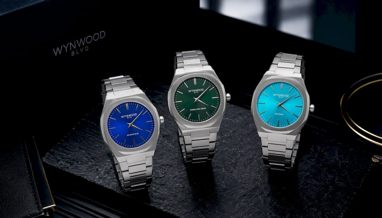
Each piece draws its color story from a real place, Miami’s coastline, the Everglades, the Florida Keys, rather than defaulting to black or white because that’s the easy minimalist choice. Browse the full Miami Inspired Watches collection to compare dial tones and case finishes side by side, or check the Miami Inspired Charms and Palm Tree Charms lines if you want the same restrained design language in a smaller piece.
If you’re sourcing branded merchandise or corporate gifts for a hotel, agency, or real estate brand, the Corporate Custom Watches program applies this same finishing standard to logo engraving and dial customization at bulk order volumes. Reach out through that page to start a custom order or request a quote.
Sources
- The Difference Between Minimalist Watches And Ones That Are Just Plain Simple | aBlogtoWatch
- Why minimalism is not an excuse for lazy watch design | OPINION
- Seamless Minimal | CITIZEN DESIGN
- Minimatik – NOMOS Glashütte | DE Store
FAQ
What Is the Best Minimalist Watch?
There’s no single best option since it depends on movement preference, case size, and style family, but the strongest choices share applied indices, domed crystals, and consistent case finishing rather than just a bare dial.
What Are Minimalist Watches, Exactly?
Minimalist watches strip a design down to essential elements, hands, markers, and often a date window at most, while relying on finishing and proportion rather than dial clutter to create visual interest.
What Watches Are Gen Z Wearing?
Gen Z buyers have gravitated toward compact, minimalist-leaning cases with colored dials and automatic movements, a trend that favors personality through color rather than logos or complications.
What Is the Best Low-End Luxury Watch?
In the low-end luxury bracket, look for stainless steel construction, an automatic movement, and consistent case finishing. Those three factors matter more than brand name at this price point, since finishing quality directly affects perceived value.
How Much Do Wynwood Blvd Watches Cost?
Current pricing for Wynwood Blvd’s Miami Inspired Watches is listed on the collection page, and custom corporate orders are quoted directly through the B2B custom watches page.