Watch Color Trends 2026: What Collectors and Buyers Should Pick
The dominant watch color trends for 2026 center on five palette families: deep and icy blues, green shades from olive to petrol, burgundy and oxblood, earth tones including ochre and khaki, and warm neutrals like champagne and cream. If you want one buying verdict: blue is the safest priority for wearability, champagne is the rising versatile neutral, and stone-dial pieces are worth the premium if you can find them.
Buy now: Blue and champagne dials in steel cases. Both are widely available and pair with almost any outfit. Consider for variety: Olive green, petrol teal, and burgundy. Strong trend momentum, slightly narrower styling range. Skip or wait: Bright accent colors like sunset orange unless you have a specific look in mind. Bold, fun, but harder to wear daily.
Key Takeaways
The 2026 watch color palette is led by blue and green, with champagne emerging as the most versatile neutral and stone dials carrying the highest premium signal of the year.
| Point | Details |
|---|---|
| Blue leads the palette | Blue appeared on 32 of roughly 123 Watches & Wonders releases, making it the safest daily-wear choice. |
| Green rewards shade specificity | Olive and pine outperform generic bright green for versatility and long-term wearability. |
| Champagne is the rising neutral | Warm champagne tones pair with gold and steel cases and work across dress and casual contexts. |
| Gold nearly matched steel in releases | 47 gold releases versus 46 steel signals a premium push; gold cases raise price floors on trending colors. |
| Wynwoodblvd covers the core palette | Atlantic Blue, Everglades Green, and Sunset Orange map directly to the three strongest 2026 color families in 40mm steel. |
Table of Contents
- What are the watch color trends for 2026?
- How do materials and dial finishes change perceived color?
- How do design proportions interact with your color choice?
- How do you style 2026 watch colors with your wardrobe?
- How do you choose which 2026 colors to buy?
- What does the release data say about color prominence in 2025–26?
- What should collectors watch for in the rest of 2026?
- How do sustainability and eco-friendly materials affect 2026 watch colors?
- What does color psychology tell you about choosing a watch color in 2026?
- What are the predicted color trends for smartwatches in 2026?
- How do 2026 color trends compare to previous years?
- The color choices that actually matter on the wrist
- Wynwoodblvd watches in the 2026 palette
- Sources
What are the watch color trends for 2026?
The 2026 palette is not a single color story. It is a deliberate spread across warm and cool tones, driven by brands using wider color palettes as a core differentiation strategy across every price tier.
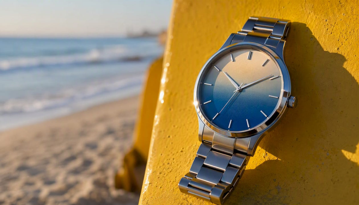
Blue anchors the palette. Deep navy reads formal and collected; icy sky blue reads fresh and modern. Both work on dress watches and sport cases. Rolex has leaned into blue dials across multiple references, and Vacheron Constantin has used deep blue lacquer on several recent dress pieces.
Green is the most varied family. Olive and pine are the shades to prioritize. They carry a vintage warmth that generic bright green lacks. Petrol and teal sit in the middle, cooler and more contemporary. Zenith and Nomos have both used green shades that lean toward the muted, earthy end of the spectrum rather than the saturated end. Green had 16 new releases counted in one analyst’s Watches & Wonders dataset, making it the second most represented color family.
Burgundy, brick, and oxblood are the 2026 breakout for collectors who want something less expected. Stylist Ilaria Urbinati links these 1970s-inspired hues directly to the broader fashion cycle that is pulling retro palettes back into watch design. Chopard has used deep red-adjacent tones on select dial references, and the shade pairs well with gold cases.
Earth tones (khaki, ochre, tan, beige) are quieter but gaining ground. They read well on smaller cases and pair naturally with casual wardrobes. Ochre in particular is worth watching as a specialty shade.
Champagne and warm neutrals are the surprise story of 2026. Loupe’s trend guide calls out champagne as a breakout tone that pairs well with two-tone and gold cases, giving it a vintage feel without looking dated.
Cloud Dancer and soft whites are the clean, minimal option. They read almost like cream and work well on ultra-thin dress watches.
Sunset orange is the accent color of the year. Bulgari has used warm orange tones on select pieces. It is bold, it photographs well, and it is genuinely fun to wear. Just know it is a statement, not a daily driver.
Pro Tip: If you have warm undertones in your skin, olive green, champagne, and ochre will complement your wrist better than icy blue or stark white. Cool undertones? Deep navy and petrol teal are your best options.
How do materials and dial finishes change perceived color?
The same color reads completely differently depending on what it is made of and how it is finished. This is where most buyers make mistakes when shopping online.
Material-driven color is the premium tier. Stone dials (sodalite, jasper, onyx, aventurine) do not just add a color. They add depth, texture, and light behavior that a painted or lacquered dial cannot replicate. Monochrome documented sodalite, jasper, onyx, and aventurine appearing on headline launches in 2026. These are not mass-market moves. Stone dials appear in small absolute numbers but carry outsized headline impact, which means higher prices and limited runs.
Common finishes and what they do to color:
- Sunburst: Color radiates from the center outward, creating a gradient effect. Blue sunburst dials look almost metallic in direct light.
- Fumé/gradient: Color deepens from center to edge. Adds drama to neutral tones like champagne or gray.
- Matte/flat: Color reads exactly as it is. Best for earth tones and soft whites where you want a clean, honest look.
- Textured (linen, stone): Breaks up the color surface. Adds tactile interest and makes the dial look more expensive.
- Skeleton/openworked: No dial color at all. The movement itself becomes the visual. Functions like a color trend by completely changing how the watch reads.
Case material shifts color temperature. Yellow gold warms every dial color it frames. White gold and steel cool it down. Titanium sits between steel and gold in warmth, with a slightly darker, grayer tone. The market signal here is clear: 47 gold releases versus 46 steel releases were counted in the Watches & Wonders dataset, a near-even split that signals a premium push toward gold in 2026.
When you are looking at product photos, check for three things: whether the color shifts between the center and edge of the dial, whether the surface has any texture or grain, and whether the case metal is warming or cooling the overall tone.
How do design proportions interact with your color choice?
Case size and thinness are not separate from color. They change how a color lands on the wrist.
Ultra-thin cases were a defining trend across multiple high-end launches heading into 2026. A slim profile makes bold colors feel more refined. A deep burgundy or oxblood dial on a 7mm-thin case reads as sophisticated. The same color on a thick sport case reads aggressive.
Smaller diameters (36–39mm) tend to soften color impact. Subtle tones like champagne, soft white, and olive work especially well here because the smaller canvas does not overwhelm the wrist. Larger cases (42mm and above) can carry bolder colors without the dial feeling too loud.
The 37–42mm range remains the practical sweet spot for most wrists. Within that band:
- 37–39mm: Best for champagne, cream, soft white, and muted earth tones. Delicate colors read well at this size.
- 40–42mm: Works for the full palette. Blue, green, burgundy, and orange all read clearly without overpowering.
- Under 36mm: Stick to high-contrast dials (dark or light) so the details stay legible. Avoid mid-tone fumé gradients that can look muddy at small sizes.
Skeletonized dials deserve a separate note. Analysts who cataloged Watches & Wonders releases found that skeleton dials ranked as a top aesthetic choice, functioning like a color trend by changing how a watch reads entirely. If you want something visually distinctive without committing to a specific color, a skeleton dial on a steel case is a strong 2026 choice.
Pro Tip: When shopping online, look for wrist shots from reviewers with a similar wrist size to yours. A 40mm watch on a 6-inch wrist reads very differently than on a 7.5-inch wrist, and color impact scales with perceived case size.
For readers considering women’s ultra-thin watches, thinness amplifies the elegance of soft colors like champagne and Cloud Dancer while keeping bolder shades like burgundy from feeling too heavy.
How do you style 2026 watch colors with your wardrobe?
Color on the wrist works best when it connects to something you are already wearing, not when it fights for attention.
Blue is the most versatile color in the 2026 palette. Deep navy pairs with everything from a charcoal suit to jeans and a white shirt. Icy blue works well with lighter neutrals and summer fabrics. It is the closest thing to a universal daily driver in the trending palette. For outfit pairing ideas that extend to sport and leisure contexts, color in athletic wardrobes follows similar principles: cool tones anchor a look while warm accents add energy.
Green (olive/pine) pairs naturally with earth tones, tan leather, and khaki. It is a strong choice for business-casual and weekend wear. Avoid pairing it with other saturated colors. Let it be the statement.
Burgundy and oxblood work best with neutral wardrobes. Gray, black, navy, and camel all let the dial color stand out. This is a power-dressing color. It reads well in formal and business settings.
Earth tones (ochre, khaki, tan) are the easiest to wear casually. They blend into relaxed outfits without looking like you tried too hard. Pair with denim, linen, and natural fabrics.
Champagne and warm neutrals go with almost everything. They are the new black for watch dials. Dress them up with a gold bracelet or dress them down with a tan leather strap.
The most versatile colors that go with everything: black, brown, silver/steel, and now champagne. These four cover every occasion without requiring you to think about coordination.
Strap swaps are underused. A petrol teal dial on a steel bracelet reads sporty. The same dial on a tan leather strap reads vintage and relaxed. A burgundy dial on a black rubber strap reads modern and athletic. Swapping straps costs almost nothing and doubles the range of any on-trend dial.
What not to do with loud colors: Sunset orange and bright accent tones work best as a single focal point. Do not pair them with a patterned shirt or a colorful jacket. Wear them with solid neutrals and let the watch do the talking.
How do you choose which 2026 colors to buy?
Before you commit, run through this checklist:
- Intended use: Daily wear needs a versatile color (blue, champagne, steel). Special occasions allow bolder choices (burgundy, stone dial).
- Versatility: Will this color work with at least 70% of what you already wear?
- Rarity: Stone dials and limited-run specialty shades are harder to find later. If you see one you want, the window is short.
- Price tier: Gold cases add a significant premium regardless of dial color. Steel and titanium keep costs lower while still delivering the same trending shades.
- Finish and material signals: Sunburst and fumé finishes photograph well and tend to hold secondary-market interest better than flat matte dials.
Timing matters. Watches & Wonders in spring is the primary release window for new colors. Early entries in a trend, especially limited-color references from Rolex, Vacheron Constantin, or Bulgari, tend to be more collectible than later mainstream iterations. If a color appears on a high-profile release in spring and you want it, waiting for a broader rollout often means waiting a year or more.
Numbered buying sequence for color decisions:
- Identify your primary use case (daily, dress, collection piece).
- Choose the palette family that fits your wardrobe.
- Decide on case material based on budget (steel for value, gold for premium).
- Check finish type in product photos before buying.
- Confirm availability: limited stone-dial and specialty-shade pieces sell through quickly.
For stainless steel automatic watch options that deliver on-trend colors without precious-metal pricing, steel cases in blue, green, and champagne cover the full 2026 palette at accessible price points.
What does the release data say about color prominence in 2025–26?
The numbers from Watches & Wonders give the clearest picture of which colors actually dominated the 2026 release cycle.
Blue appeared on 32 of approximately 123 releases in one analyst’s dataset, roughly a quarter of all new pieces. Green followed with 16 releases. No other single color came close to those counts.
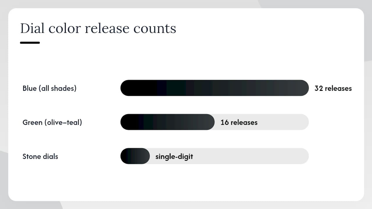
| Color family | Approximate release count | Notes |
|---|---|---|
| Blue (all shades) | 32 | Largest single color group |
| Green (olive to teal) | 16 | Wide shade variation |
| Stone dials (sodalite, jasper, onyx, aventurine) | Single digits | High impact, low volume |
The gold vs. steel split is the most telling material signal. With 47 gold releases against 46 steel in the sample, the market is signaling a premium push. Color and material are moving together: champagne and burgundy dials are appearing more frequently in gold cases, while blue and green remain strong in steel.
Stone dials are a small-count, high-visibility story. They were present in single-digit examples but generated disproportionate coverage. That gap between count and coverage tells you these are premium decorative choices, not a mass-market shift. Expect higher prices and shorter availability windows.
Retail and curator roundups from specialists like the European Watch Company and Bucherer consistently amplify certain colors after major releases, which then influences secondary-market interest. Following these curators is a practical early-warning system for which colors are gaining traction beyond the initial release cycle.
What should collectors watch for in the rest of 2026?
The 2026 palette will likely consolidate rather than broaden through the second half of the year. Blue and green have enough release volume to sustain momentum. Champagne is still building. The specialty shades (ochre, oxblood, stone dials) will remain limited-run and premium-priced.
Three near-term signals worth tracking:
- New stone-dial launches: Any brand adding sodalite or aventurine to a mainstream reference signals the trend moving from niche to broader adoption.
- Gold vs. steel release balance: If gold continues to outpace steel in new colorways, expect price floors to rise on trending shades.
- Olive and ochre gaining traction: These earth tones are currently underrepresented in release counts relative to their fashion-cycle momentum. A breakout is plausible in the second half of 2026.
If you want a color that is trending now and available widely, buy blue or champagne in steel now. If you want a collectible piece, target stone-dial or limited-shade releases before they sell through.
How do sustainability and eco-friendly materials affect 2026 watch colors?
Sustainability is changing which materials brands choose, and that directly affects the color palette available to buyers. Natural stone dials (sodalite, jasper, aventurine) are part of a broader move toward materials with lower processing requirements than synthetic alternatives. Brands including Chopard have made public commitments to ethical sourcing of metals and stones, which influences which materials appear in new collections.
Recycled steel and responsibly sourced titanium are becoming more common in mid-range and premium releases. Titanium, in particular, carries a natural gray-blue tone that complements the 2026 blue and neutral palette without requiring surface treatments. Its lighter weight is a practical benefit, but its natural color is increasingly a design asset.
The sustainability push also favors muted, natural-looking tones over heavily processed synthetic colors. Earthy shades (khaki, ochre, tan) and warm neutrals (champagne, cream) align naturally with materials that have minimal surface treatment. This is one reason earth tones are gaining ground in 2026 alongside the fashion-cycle drivers.
What does color psychology tell you about choosing a watch color in 2026?
Color psychology is not abstract when it comes to watches. You wear the color on your wrist in every meeting, every social situation, and every photo. The choice signals something.
Blue communicates reliability and calm. It is the most universally trusted color across cultures, which is part of why it dominates watch releases. A blue dial reads as dependable without being boring.
Green signals balance and connection to nature. Olive and pine shades in particular read as grounded and considered rather than flashy. They work well for buyers who want to signal taste without loudness.
Burgundy and oxblood carry authority and confidence. They are not neutral choices. Wearing one in a professional setting signals that you pay attention to detail and are comfortable with a strong aesthetic opinion.
Earth tones (ochre, khaki, tan) communicate approachability and ease. They are the least threatening colors in the palette, which makes them excellent for casual and social contexts.
Champagne and warm neutrals read as refined and understated. They signal wealth without announcing it. This is why champagne is rising alongside gold cases in 2026.
Orange is energy and optimism. It is the most extroverted color in the 2026 palette. Wear it when you want to be noticed.
What are the predicted color trends for smartwatches in 2026?
Smartwatch color trends in 2026 follow the traditional watch palette with a lag and a practical filter. The same blue, green, and neutral families dominate, but the execution is different. Smartwatch cases are predominantly aluminum and stainless steel, and the “dial” is a screen rather than a physical surface, so color expression shifts to the case, the band, and the watch face design.
Case colors for smartwatches in 2026 lean toward midnight (deep navy-black), starlight (warm silver-cream), and green. These map directly to the traditional watch palette. Band colors are where the accent tones appear: orange, teal, and burgundy are all available as band options on major platforms, letting wearers access the 2026 palette without committing to a permanent case color.
The key difference from traditional watches: smartwatch color is more modular. You can swap a band in 30 seconds. This makes bold accent colors (orange, teal) more practical on a smartwatch than on a traditional piece where the dial color is fixed.
How do 2026 color trends compare to previous years?
The 2026 palette is a continuation and deepening of trends that started around 2021, not a sharp break from them.
Green dials began their rise around 2020–2021 with several high-profile Rolex and independent brand releases. By 2023–2024, green was mainstream across price tiers. In 2026, the story is about shade refinement: olive and pine over generic bright green, petrol over turquoise. The color family is mature; the conversation has moved to specificity.
Blue has been the dominant dial color for most of the past decade. What changed in 2026 is the shade range. Icy and sky blues are now as prominent as deep navy, giving the family more versatility across dress and sport contexts.
Burgundy and earth tones are genuinely new entrants at scale. These shades were present in small numbers before 2025 but are now appearing across multiple brands and price points, driven by the 1970s fashion cycle that stylist Ilaria Urbinati and others have documented.
Champagne is the clearest evolution from the previous neutral story. White and silver dials dominated the neutral category for years. Champagne is warmer, more vintage-feeling, and pairs better with the gold cases that are now nearly matching steel in release volume.
The biggest shift from 2022–2024 to 2026: color is no longer a fashion-brand-only move. As Ariel Adams noted, brands at every price tier are using color as a core differentiation tool. That means the 2026 palette is available to buyers at $500 and $50,000 alike.
The color choices that actually matter on the wrist
Most color trend coverage focuses on what brands are releasing. The more useful question is what actually holds up after you have worn a watch for six months.
Blue wins because it is genuinely neutral in practice. It reads as a color without demanding coordination. Champagne is earning the same reputation. Both are worth prioritizing if you want a watch that works across your whole wardrobe.
The earth tones and burgundy shades are more rewarding for collectors who build intentional wardrobes. They reward specificity. An olive dial on a 39mm steel case with a tan leather strap is a complete, considered look. It does not work for everyone, but for the right buyer it is more satisfying than another blue dial.
Stone dials are the most honest luxury signal in the 2026 palette. They cost more because they are genuinely harder to make and more visually interesting than any painted surface. If budget allows, a sodalite or aventurine dial is worth the premium over a standard lacquered version of the same color.
The one thing most buyers underestimate: finish matters more than hue. A sunburst blue dial and a matte blue dial are not the same watch. Check the finish before you buy, not just the color name.
Wynwoodblvd watches in the 2026 palette
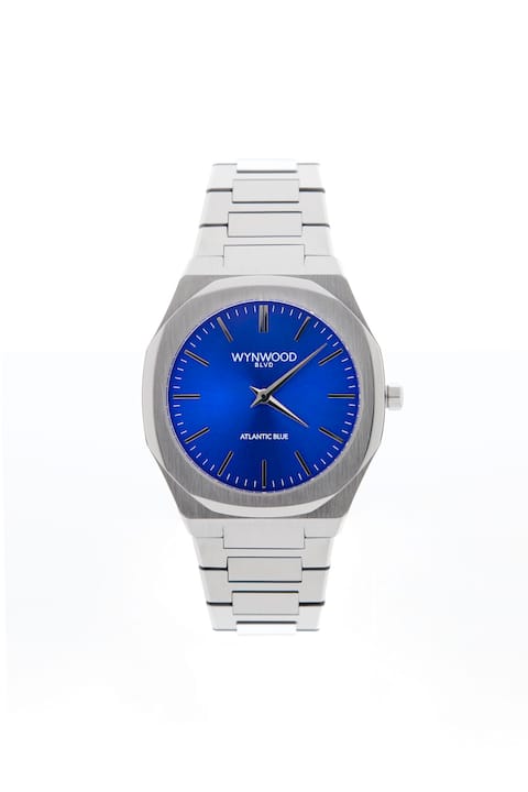
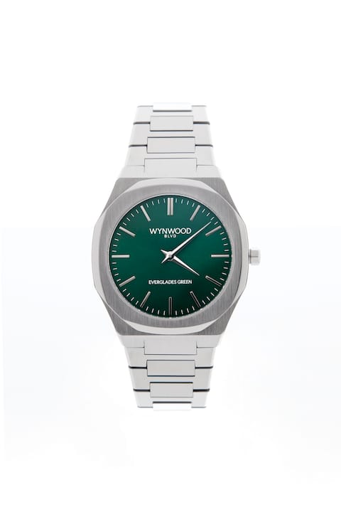
The 2026 color story maps directly onto what Wynwoodblvd has been building from Miami. The Atlantic Blue automatic watch sits squarely in the dominant blue family, a deep coastal blue on a stainless steel case that covers both the dress and casual contexts the trend data supports. The Everglades Green hits the olive-to-pine range that analysts counted as the second strongest color family in 2026 releases. And the Sunset Orange delivers the bold accent tone for buyers who want the statement piece the palette calls for.
All three are 40mm stainless steel automatics, which puts them in the practical sweet spot for case size and keeps them at accessible price points compared to gold-case alternatives. If you want to browse the full color lineup, the Miami-inspired watch collection covers the current palette in one place. For businesses looking to put the 2026 palette on branded merchandise, custom watch options include dial color and logo customization.
Sources
These are the most reliable sources for tracking ongoing color releases and trend shifts through the rest of 2026:
- The Biggest Watch Trends of 2026, According to the Numbers | GQ
- Watch trends 2026 — Who What Wear
- Top 10 Timepieces & Product Trends From Watches & Wonders Geneva 2026 | aBlogtoWatch
- Watch Dial Color Trends 2026 - Green and Champagne | Loupe
- Editorial — Watches and Wonders 2026: the trends that defined the year | Monochrome Watches
- The Dial Colors Defining 2026’s Biggest Watch Releases | European Watch Company